Technology that Matters
2 December 2022
As the reach of the digital world expands, User Experience or UX is a term that seems to get thrown around a lot. Wireframing, prototyping, user testing, design workshops, they are often the more glamourous parts of a website design project.
But what happens to user experience after the fun and fan fare of your new website’s launch? We wanted to use today’s session to talk about how user experience changes over time and some ideas and tips we have to stop the slow death of your website!+
Change is unavoidable. We live in an every changing world and enjoy the benefits of new ideas, new technologies. And that’s a good thing.
Last year we worked with New Plymouth District Council on the redevelopment of their main council website. It’s a beautiful site and one which we are all really proud of.
My guess, that’s how the designer in the early 2000’s felt like too…
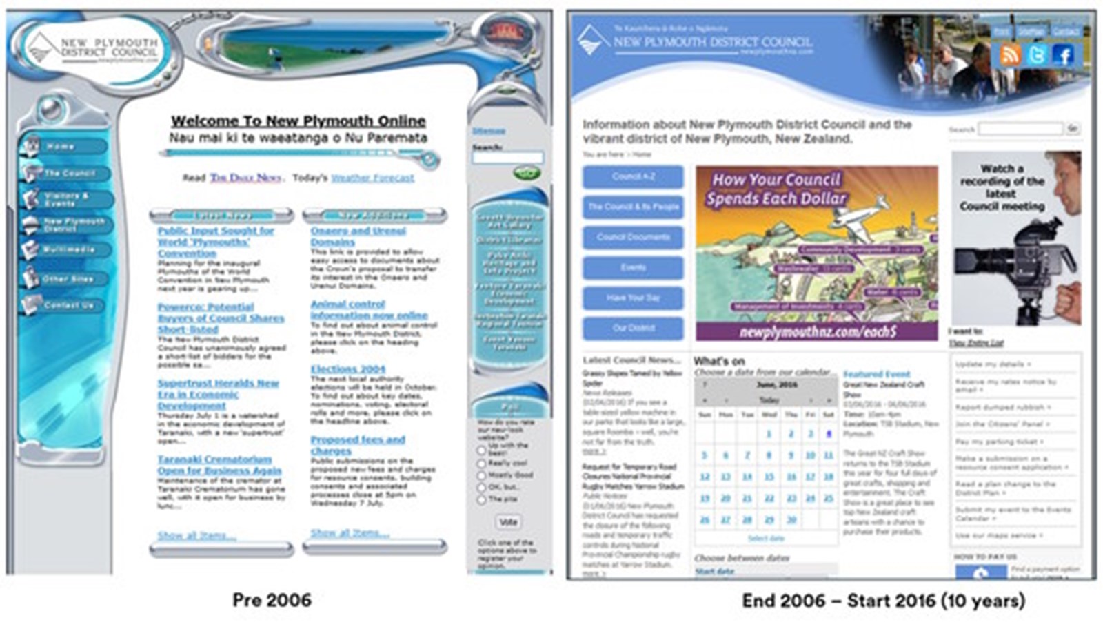
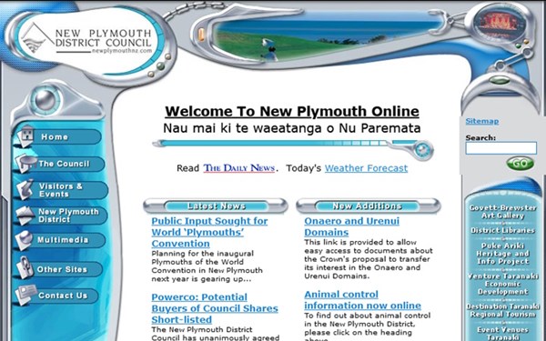
This is the NPDC website looked like in the pre mobile days – I think its like fashion and some of these design styles are due for a comeback. The 2006 - 2016 website lasted 10 years which is a long time for a website.
Then we get to 2016 we have really clean and modern looking website.

This site lasted six years, the big drivers for the upgrade of this website was the underlying technology platform which was costing New Plymouth rate payers a lot of money for licensing and hosting fees.
Here’s where we are today. The new site launched early this year and we were super proud to see NPDC acknowledged with an ALGIM - who doesn’t like external recognition?!
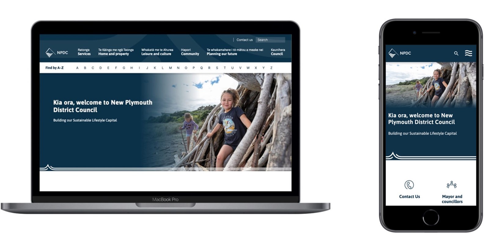
NPDC ALGIM Supreme Winner 2021
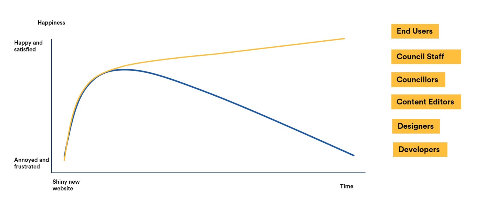
If we take the past 18 years of NPDC’s website and tried to map out how people – both users and council staff might have been feeling, our experience tells us that this is likely to have been this kind of emotional roller coaster. The high of a new design followed by the gradual decline as the site ages.
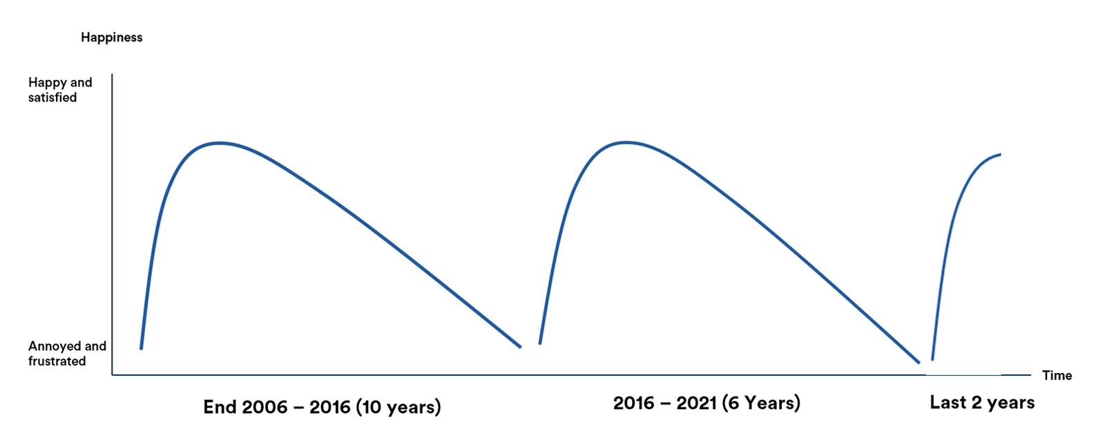
18 year emotional roller coaster
What this shows us is that your average website has typically a 5-10 year lifecycle – this obviously depends on a lot of factors many of which are outside of the council’s control. Most of us know what being at the bottom of this cycle feels like – as professionals we all want to do a good job and we want our front window display to reflect this.
Luckily for us right now we are 2 years into a redevelopment process and we are all still riding the high that comes with a great project where everyone’s super engaged in the process and really proud of the work they have done.
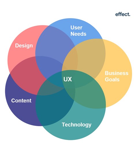
Well it all comes down to user experience and great User Experience isn’t easy to achieve – it comes from:
If you’ve gone through a website development process, hopefully these are all things that you worked through your chosen provider to understand but they don’t go away after the website is launched.
They continue to be the keys to keeping your user experience on track.
But what happens from here as the world around us keeps changing. New technologies become available, political directions shift and new trends come and go?
But what happens from here as the world around us keeps changing. New technologies become available, political directions shift and new trends come and go?
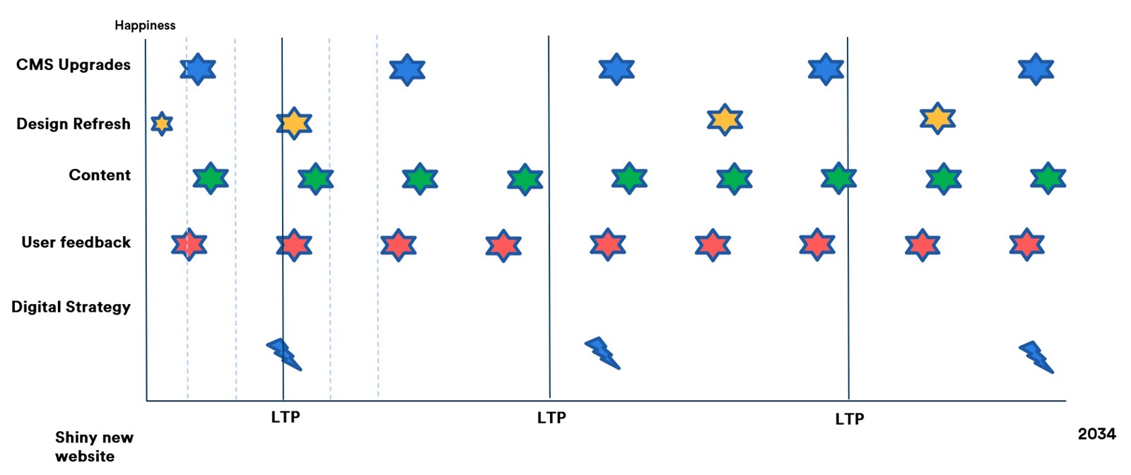
If we pull this altogether and look at what the next then years of your website might look like then we come up with something like this.
As councils you have a natural planning cadence to work with in your LTP and annual planning cycle.
If you’re on one of the common CMS platforms like Umbraco or Silverstripe then you should also have a pretty good idea of when the major CMS updates will be available and can look to factor these in.
From there you can refine and iterate – continuous happiness will come from continuous improvement.
Other clients have dedicated authentication software that is used across their organisations' business systems, the website's CMS accounting for just one of these systems. We recently completed 2FA for Maritime NZ’s intranet using Okta, an authentication platform Maritime uses across their organisation.
Deciding which authenticator is best for your organisation will depend a lot on your organisation and who currently has access to the CMS or web application you're looking to protect. Regardless of which option you choose, users will need to provide two pieces of information to be able to access the CMS/application. The Cert NZ Guide has a great explanation of the different types of information that could be used.
If you’d like to beef up security on your CMS, get in touch, we’re happy to help you understand the benefits of 2FA and the options available.
Signup here if you want to keep up with our quarterly newletter